GPS TrackIt
Building UX From the Ground Up in a Growing SaaS Company
Role: Head of UX / UX Manager
Industry: B2B SaaS, Fleet Management & Telematics
Tools: Sketch, Jira
Methods: Agile, User Research, Design Systems, Beta Programs
⸻
Overview
GPS Trackit is a global fleet management platform used by thousands of companies to monitor vehicles, analyze driver behavior, and manage operational performance.
When I joined the company, the product had grown rapidly but lacked a formal UX practice. Product decisions were largely feature-driven, resulting in fragmented workflows, inconsistent UI patterns, and usability challenges across the platform.
I was brought in to establish UX from the ground up and lead the redesign of core product experiences, while introducing scalable design systems and research-driven development practices.
My work focused on simplifying complex workflows, improving data-heavy interfaces, and creating a consistent framework that could support long-term product growth across web and mobile applications.
The following case study highlights several key initiatives that shaped the platform, including the system redesign, design system architecture, safety scoring, video workflows, reporting tools, and mobile experience.
Platform Summary & Redesign
The Challenge
The platform had evolved organically through years of feature additions, creating complexity for both users and internal teams.
Fleet managers relied on the system to monitor vehicles, analyze safety data, and manage operations, yet the interface had become difficult to navigate and inconsistent across products.
Key challenges included:
Fragmented UX patterns across modules
Data-heavy workflows with limited visual hierarchy
Low feature adoption due to usability friction
Lack of formal UX processes or research practices
⸻
My Approach
Through user interviews, workshops, and in-app feedback analysis, I worked with Product and Engineering to identify critical usability issues and prioritize improvements.
The redesign focused on:
Simplifying complex workflows
Improving data visualization and hierarchy
Standardizing navigation and UI patterns
Creating scalable interaction frameworks
In parallel, I introduced structured UX processes to support long-term product growth.
⸻
Key UX Decisions
Established consistent navigation patterns across modules
Introduced clearer visual hierarchy for data-dense screens
Reduced workflow steps for common tasks
Standardized layout structures to support scalability
Integrated research into product planning cycles
⸻
Outcome
The redesign reduced friction across core workflows, improved usability, and created a foundation for future feature development.
The platform shifted from feature-driven decisions to a structured, repeatable UX system that supported both product velocity and brand cohesion.
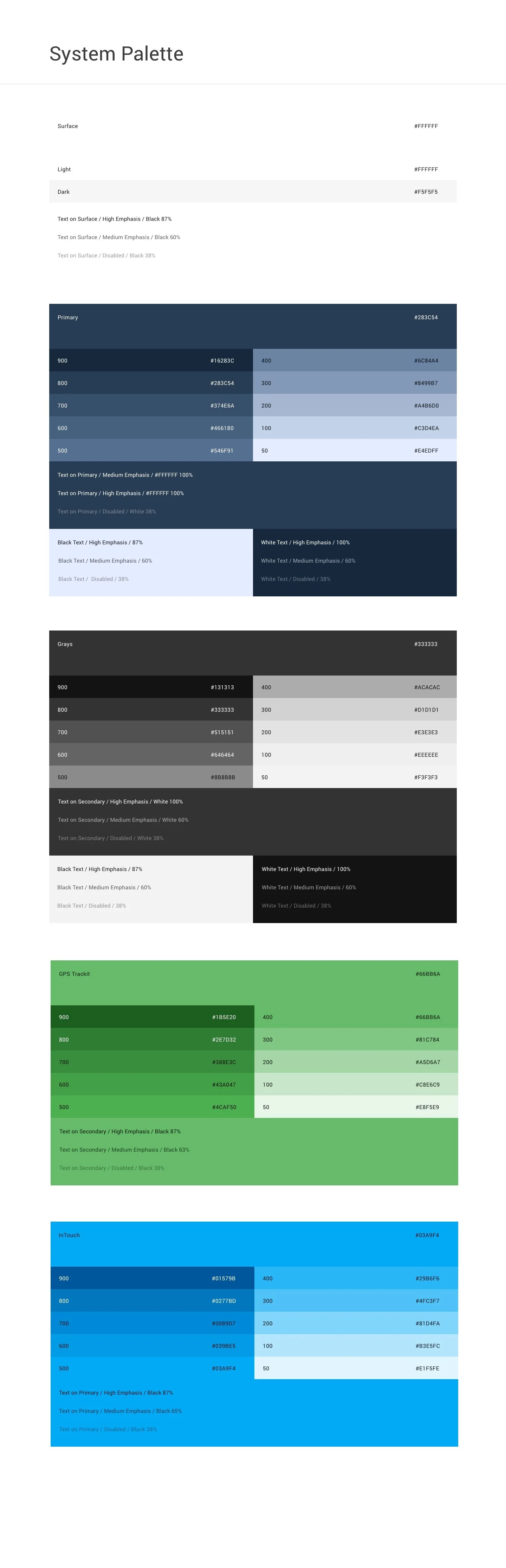
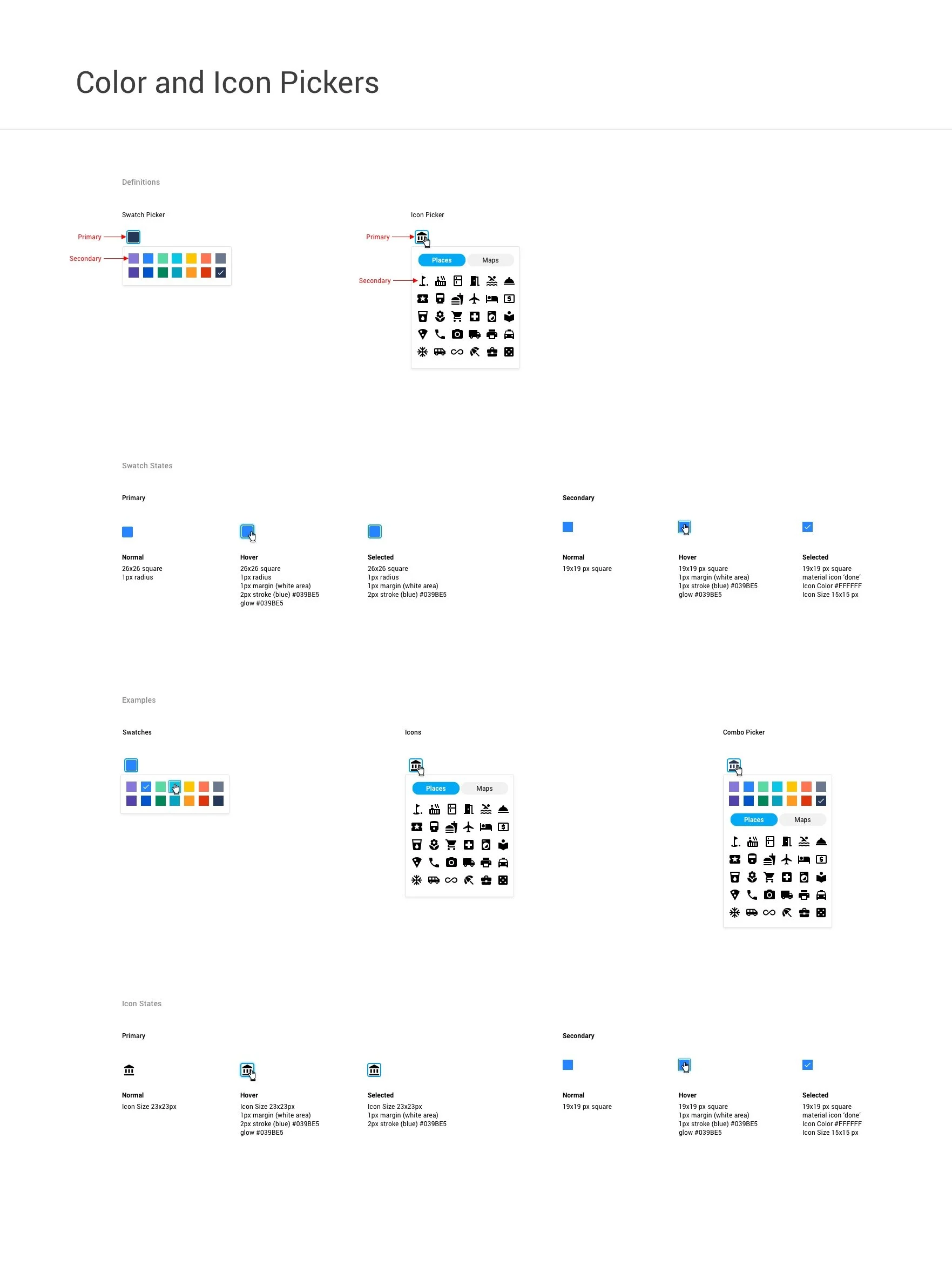
Style Guide & Design System
Establishing the UX Foundation
The Challenge
As the platform expanded, inconsistent UI patterns and ad-hoc design decisions made it difficult to scale new features without introducing additional complexity.
Engineering teams lacked reusable components, and visual inconsistencies across products slowed development and reduced usability.
A unified design framework was needed to support long-term growth.
⸻
My Approach
To formalize design standards across the platform, I architected a scalable design system that unified visual language, interaction patterns, and brand elements across products.
The system was built to support both designers and engineers, ensuring that new features could be implemented consistently without slowing development.
⸻
Key UX Decisions
Defined typography, color, spacing, iconography, and layout rules
Built a reusable component library for engineering implementation
Standardized interaction behaviors across modules
Created documentation to support cross-team adoption
Integrated the system into product and engineering workflows
⸻
Outcome
The design system reduced feature implementation time by 50%, improved cross-product consistency, and accelerated collaboration between Design and Engineering.
The organization moved from ad-hoc design decisions to a scalable framework that supported long-term product growth.


Driver Behavior Feature
Turning Risk Data into Actionable Coaching
The Challenge
Fleet managers lacked clear, actionable visibility into risky driving behaviors. While telematics data was abundant, it was not structured to support rapid risk assessment, targeted coaching, or measurable improvement over time.
Users needed a way to quickly identify high-risk drivers, understand the cause of incidents, and track behavioral trends without navigating complex reports.
⸻
My Approach
I designed a configurable driver safety scoring system that translated complex telematics data into an intuitive risk framework.
The goal was to make risk visible at a glance while allowing deeper analysis when needed, enabling fleet managers to move from passive monitoring to proactive coaching.
⸻
Key UX Decisions
Introduced color-coded risk levels for immediate clarity
Designed weighted scoring tied to specific driving infractions
Enabled configurable thresholds aligned with company policy
Added trend views to track behavioral improvement over time
Created driver- and vehicle-level scorecards for quick comparison
⸻
Outcome
The redesigned framework allowed fleet managers to identify high-risk drivers quickly, implement targeted coaching, and track improvement over time — supporting safer driving behavior and reducing operational risk.


Video Feature
Making Safety Footage Instantly Actionable
The Challenge
GPS-enabled video devices captured safety incidents such as hard braking, speeding, and distracted driving. However, reviewing footage was time-consuming and operationally inefficient.
Fleet managers needed a way to:
Quickly assess incident severity
Avoid unnecessary downloads
Review high volumes of clips efficiently
Make rapid coaching decisions
The existing workflow required too many steps and slowed decision-making.
⸻
My Approach
I designed a tile-based video management interface that prioritized rapid triage and in-context review.
Core design principles:
Scan first, drill down second
Minimize friction to playback
Surface relevant metadata immediately
⸻
Key UX Decisions
Introduced visual tiles displaying incident snapshots with contextual details (driver, vehicle, behavior type, timestamp)
Enabled inline playback directly from the thumbnail to eliminate unnecessary navigation
Made each tile fully clickable for deeper review when needed
Structured layout for high-density review without overwhelming users
By allowing users to preview clips instantly, the feature reduced friction and improved incident response speed.
⸻
Outcome
The redesigned workflow reduced investigation friction and accelerated incident review, enabling faster, more confident coaching decisions across high-volume fleets.
Report Feature
Stabilizing and Redesigning a Critical Workflow
The Challenge
As part of a multi-platform consolidation effort, the reporting feature required a redesign to support a new tagging framework.
The initial release introduced performance issues, workflow friction, and user frustration, threatening trust in a mission-critical tool.
Fleet managers rely on reporting to:
Monitor driver safety and compliance
Track fuel usage and mileage
Access temperature and asset data
Run tax and operational reports
When the new system underperformed, adoption suffered.
⸻
My Approach
I led the investigation and redesign effort, working closely with users and internal teams to identify the root causes of friction.
Through user workshops, interviews, and in-app feedback analysis, I identified:
Workflow friction introduced by tagging
Performance bottlenecks
Software malfunctions affecting trust
Overly complex report configuration
⸻
Key UX Decisions
I redesigned the reporting experience to prioritize speed, clarity, and repeatability while maintaining compatibility with backend constraints.
Key improvements included:
Simplified tagging logic and report configuration
Enabled favoriting for frequently used reports
Added inline editing and bulk actions
Improved data readability and print layouts
Restructured the workflow to reduce load time and errors
I partnered closely with Product, Architecture, and Development to ensure feasibility across backend systems and React architecture.
⸻
Validation & Rollout
Established a structured beta program
Recruited qualified users through workshops, Sales, and Support
Created a dedicated Slack feedback loop for internal teams
Conducted post-beta interviews to validate improvements
Iterated through design reviews and Jira refinement cycles
Users began running all reports through the beta version due to improved performance and usability.
⸻
Outcome
The redesigned reporting feature restored user trust, improved performance, and significantly increased adoption.
What began as a failed release became a stable, high-performing workflow validated by real users.


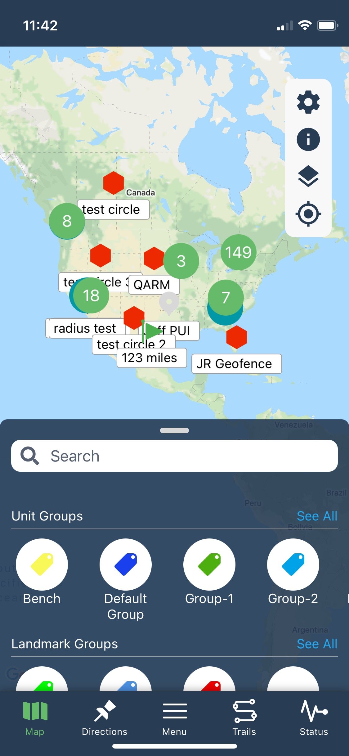
Mobile App
Extending Core Functionality to Field Users
The Challenge
Fleet managers and technicians needed access to critical platform functionality while in the field.
The desktop experience was data-rich, but not optimized for on-site decision-making, limited connectivity, or mobile constraints.
Users needed fast access to essential information without navigating complex desktop workflows.
⸻
My Approach
I designed a mobile-first experience that prioritized speed, clarity, and access to high-value actions.
The interface reduced cognitive load by surfacing only the most essential workflows for field use.
⸻
Key UX Decisions:
Rapid visibility into unit and vehicle status
One-tap access to directions and site navigation
Quick retrieval of diagnostic data
Immediate access to dash cam footage when needed
Reduced screen complexity to support field conditions
Optimized layout for limited connectivity and smaller screens
⸻
Outcome
The mobile app extended platform functionality beyond the office, enabling faster on-site decision-making and improving operational responsiveness for field users.
The simplified interface reduced cognitive load while maintaining access to critical data.
Executive Feedback.
-
“Jessica created the foundation required for growth within a SaaS company that had no previous focus or attention to user experience.” “She has repeatedly shown excellence in reinventing our flagship product’s user experience… driving significant improvement in feature adoption and churn reduction.” “I firmly believe that Jessica is an irreplaceable asset to any team seeking a skilled and experienced UX Manager.”
Devin Meadows, Director of Product • GPS Trackit
-
“Jessica is an exceptional UX designer with a strong passion for creating intuitive and delightful user experiences.” “She excels in cross-functional team environments… aligning design decisions with business objectives.” “Her analytical mindset allows her to interpret data and feedback to continually iterate and improve her designs, resulting in highly optimized user experiences.”
Jason Craven, VP of Technology • GPS Trackit
GPS Trackit it an industry leader in providing fleet management, telematics and video telematic solutions to hundreds of thousands of vehicles worldwide. Since 2002, GPS Trackit has been a pioneering force in the cloud-based, IoT fleet solutions industry. Our award-winning, industry-leading technology and focus on world-class customer service has earned us a place on Deloitte's Technology Fast 500 list and serves over 12,000+ fleets globally.