VIPRE
Brand, Product & Experience Design
Role: Senior Designer
Industry: Cybersecurity / Enterprise Software
Tools: Adobe Creative Suite, Sketch, Figma, After Effects
Methods: Brand identity, Design systems & brand guidelines, Website design, Product packaging, Mobile application design, Marketing campaigns & advertising, Infographics & data visualization, Trade show environments & event design, art direction, signage
Overview
VIPRE develops cybersecurity products focused on endpoint and email protection along with advanced threat intelligence tools for consumer and enterprise markets.
As Creative Manager, I led the evolution of the VIPRE brand across product, digital, and marketing experiences. My role spanned brand identity, packaging, digital platforms, advertising campaigns, and environmental design, ensuring a cohesive visual language across all customer touchpoints.
Brand Identity
Modernizing the VIPRE Brand
VIPRE’s brand identity was refreshed to modernize the company’s presence within the cybersecurity market while preserving the recognizable shield mark associated with protection and trust.
The redesign simplified the mark, refined the typography, and introduced a more contemporary visual language that could scale across digital products, packaging, marketing campaigns, and environmental applications.
The shield icon was retained as the core symbol of the brand, reinforcing the concept of security and defense while improving clarity and balance across different sizes and contexts.
The updated typography brought a cleaner, more modern feel to the identity while maintaining strong readability across both digital and physical applications.
Together, these refinements created a flexible identity system that could support a growing portfolio of products while maintaining consistency across platforms and marketing channels.


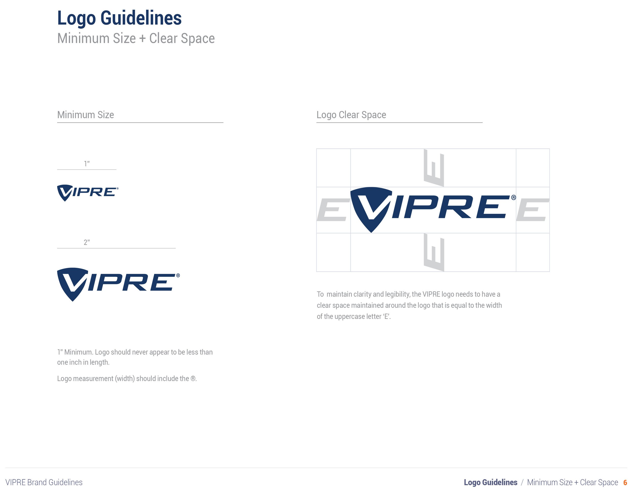
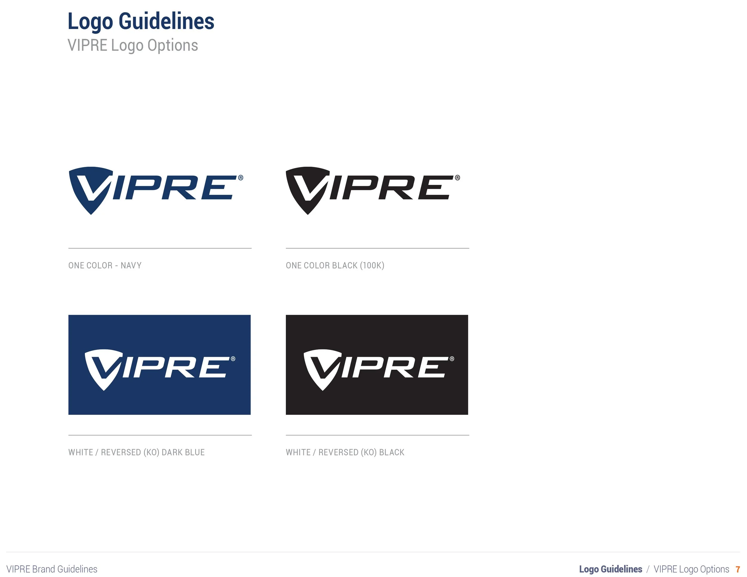
Brand Guidelines
Creating a Scalable Visual System
To ensure consistency across marketing, product, and digital experiences, I developed a comprehensive set of brand guidelines that defined the visual language of the VIPRE brand.
The guidelines established standards for typography, color usage, iconography, imagery, and logo application, providing internal teams and external partners with a clear framework for implementing the brand across platforms.
The goal was to create a system that could support a wide range of applications—from digital marketing campaigns and product interfaces to packaging and large-scale environmental graphics—while maintaining a cohesive and recognizable identity.
⸻
System Components
logo usage and clear space rules
typography hierarchy and type pairings
color palette and accessibility considerations
imagery direction and brand photography
iconography and graphic elements
⸻
Impact
The guidelines provided a unified framework that allowed marketing, product, and creative teams to apply the brand consistently across campaigns, product interfaces, packaging, and event environments.
This system ensured that as the brand expanded across new channels and initiatives, the visual identity remained cohesive and recognizable.


Website Experience
Designing the Digital Hub for the VIPRE Brand
As part of the brand redesign, I led the design and development of the VIPRE website to better communicate the company’s security expertise, product offerings, and performance credentials.
The site served as the central hub for marketing campaigns, product launches, and customer education, supporting both consumer and enterprise audiences.
The design focused on simplifying complex cybersecurity messaging while reinforcing trust through clear product benefits, performance benchmarks, and industry certifications.


Product Packaging
Modernizing Consumer Product Packaging.
The consumer packaging for VIPRE’s antivirus products was redesigned to modernize the brand and better connect with the people making purchasing decisions.
The previous packaging relied heavily on technical messaging and masculine visual cues common in cybersecurity products. Market insights revealed that many purchase decisions for home security software were actually made by women managing family computers and home networks.
The redesign aimed to balance technical credibility with a more approachable and human-centered visual language.
Key design considerations included:
Simplifying the visual hierarchy to make product benefits easier to understand at a glance
Introducing lifestyle imagery to humanize the brand and communicate real-world use
Highlighting industry certifications and testing results to reinforce trust and performance
Creating a flexible layout system that could scale across the product line
The updated packaging maintained the brand’s association with security and protection while presenting the product in a more modern and accessible way for retail environments.
The design system also allowed new product tiers and versions to be introduced without requiring a complete redesign, ensuring long-term scalability across the product family.
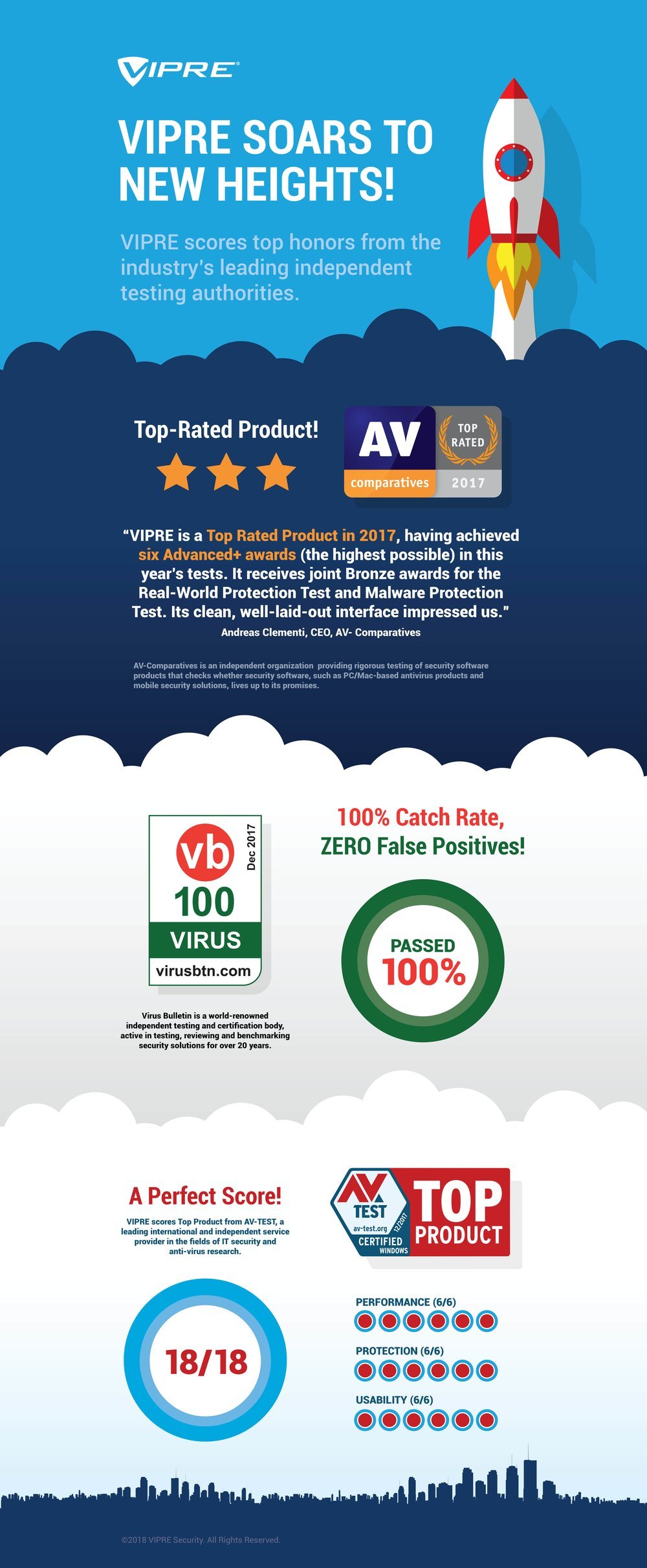
Data Visualization & Infographic
Communicating Security Performance Through Visual Storytelling
When VIPRE received top scores from several independent security testing authorities, the marketing team needed a compelling way to communicate these achievements to customers and partners.
The challenge was to present multiple performance benchmarks and certifications in a way that was clear, engaging, and easy to understand.
To translate the data into a memorable visual story, I designed an infographic that illustrated VIPRE’s performance as a rocket ascending through layers of achievement.
Each level of the composition highlights a key industry certification, including AV-Comparatives, VB100, and AV-Test results, visually reinforcing the message that VIPRE was rising above competitors in security performance.
The layered composition allowed viewers to quickly scan the results while maintaining a clear narrative structure that guided the eye upward through the data.
The infographic was used across marketing channels, including web content, presentations, and promotional materials supporting the campaign.
Marketing & Art Direction
Extending the brand across campaigns, media, and events
To support product launches and increase brand visibility within the cybersecurity industry, I extended the VIPRE brand beyond digital platforms into physical environments and campaign media.
This work translated the brand identity into large-scale applications used across industry events, marketing campaigns, and video production.
Projects included:
trade show booth environments and event graphics
large-format signage and promotional displays
campaign marketing materials
art direction for (HSN) commercial and promotional video production
These experiences were designed to create cohesive brand moments that reinforced VIPRE’s positioning as a trusted security provider while maintaining visual consistency across product, marketing, and advertising channels.
The resulting assets supported product launches, industry conferences, and marketing campaigns used across both digital and physical touch points.


VIPRE Security Group, a brand of Ziff Davis, is a privately held cybersecurity company headquartered in New York. VIPRE develops cybersecurity products focused on endpoint and email security along with advanced threat intelligence applications.